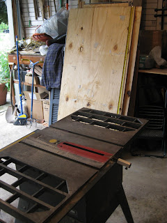
cut to size

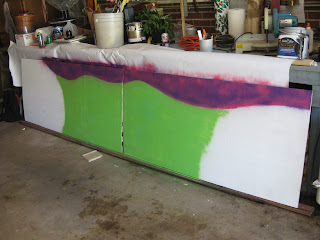
primed

the first rough layout....the initial idea was the 2 pieces would meet at Damen and Belmont, thus the black "buildings" and for some reason some rolling hills in the back ground?
.JPG)
.JPG)
also, in the original plan there was to be some baked goods at the far left and a whole herd of zombies charging down from the right side towards the deliciousness (yes, Frankenstein and Chewbacca made the initial cut, but didnt make it to the finals)


the one piece was a little short so i went through some trial and error efforts to make a suitable "extension"

and then something happened, i got a whole new perspective/outlook on this "street scene" and realized how flat and uninspiring this looked, so i went to town in an attempt to make some changes.....


and so now....here it is, almost complete....questioning whether or not to add the zombies now that i actually like the painting part......oh well, the customer is always right

questions, comments and critiques are ALWAYS welcome and encouraged......
Two Thumbs Up! I like the layering of the cityscape, which places the business somewhere awesome... Chicago. The POW! of deliciousness on the left lends itself well to the nature it will be fronting. A zombie may be a little much, but could rise from the bottom corner on the right as if came out of nowhere to be apart of the delicious experience of the Bleeding Heart Bakery. Keep up the good work. All said and done, its great!
ReplyDeleteVery cool Markus!
ReplyDelete